| Class | Property | Color token |
|---|
.bx--label | text color | $text-01 |
.bx--label-description | text color | $text-02 |
.bx--file-filename | color | $text-01 |
.bx--file__selected-file | background | $ui-01 |
.bx--file-close | fill | $icon-01 |
| Class | Property | Color token |
|---|
| File name: invalid | text color | $disabled-02 |
| Error message | text color | $support-01 |
.bx--file-filename | border-bottom | $support-01 |
The file uploader label and instruction text should be set in sentence case,
with only the first letter of the first word in the sentence capitalized.
| Class | Font-size (px/rem) | Font-weight | Type token |
|---|
.bx--label | 14 / 0.875 | Semi-bold / 600 | $heading-01 |
.bx--label-description | 14 / 0.875 | Regular / 400 | $body-short-01 |
.bx--file-filename | 14 / 0.875 | Regular / 400 | $body-short-01 |
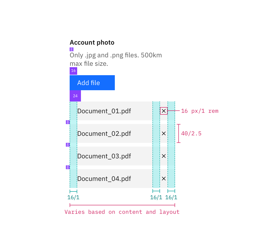
The width of an uploaded file varies based on the content and layout of a
design. Refer to the button guidelines for usage and
styling of the “Add files” button.
| Class | Property | px / rem | Spacing token |
|---|
.bx--file-filename | height | 40 / 2.5 | – |
.bx--file-filename | width | 224 / 14 | – |
.bx--file__selected-file | padding-left | 16 / 1 | $spacing-03 |
.bx--file__selected-file | margin-bottom | 8 / 0.5 | $spacing-05 |
Structure and spacing measurements for file uploader | px / rem
The following specs are not built into the file uploader component but are
recommended by design as the proper amount between file uploader elements.
| Class | Property | px / rem | Spacing token |
|---|
.bx--file-close | height, width | 16 / 1 | – |
.bx--file-close | margin-left, margin-right | 16 / 1 | $spacing-05 |
