Search
Search is an essential pattern for navigation or discovery. We live in the age of search, where a search engine is often the primary entry point into the internet. User expectations are high for the way search should work, and consistency is critical.
Overview
Searching is an intuitive method of discovery, offering users a way to explore a website or application using keywords. Most searches begin broad, with the scope narrowing as filters are applied.
The method of search you use depends on the size of the data set being searched and the location of the search within your product.
The placement of your search field depends on the construction of your application and the scope of the search. For global searches, see the global header pattern for placement guidance. See the data table component for search placement within a data table.
Anatomy
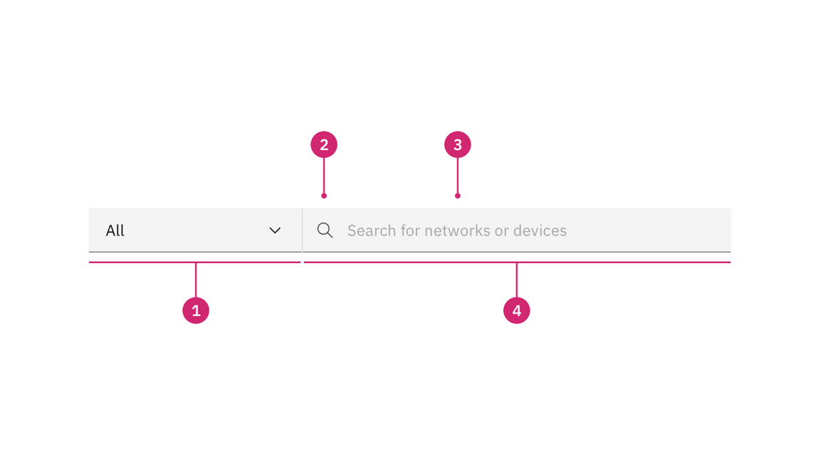
- Scope filter (optional): The optional scoped search allow users to limit their searches to a section or category of content on a website.
- Search icon: Signifies a search field. The magnifying glass icon is a universal way to indicate search.
- Placeholder text: Useful and short text hinting at what the user can search for. For example, “Search for networks or devices.”
- Text entry field: The place where a user enters their search query.
Types of search
- — Searching a catalog
— Searching a small website
— Searching a small data set within a table
— Searching a subset of information embedded within a product or application’s page
- — Assigned tasks
— Product catalogs
— Personal repositories
— Work created by the active user
Best practices
Avoid dead ends
If a search returns “No results”, suggest a follow-up action. Provide suggestions and helpful resources to aid the user in finding what they are looking for. For more on no results for searches, see the empty states pattern.
Include a loading indicator
If the search will take longer than a moment or two, include a loading indicator. Your loading state should reflect your empty state with useful helper text signaling that the search is still ongoing. Include a progress bar for advanced, resource-intensive searches. Let the user know how far along the search is, and roughly how long it will take to finish.
Display the number of results
Always include the number of search results, including for searches with no results. If you plan to offer a scope filter, also include the number of results for each scope selector.
Don’t include a label
Avoid adding a label to your search field. Users expect and understand search fields, and no label is necessary. A search icon along with useful placeholder text should clearly indicate that the field is intended for search.
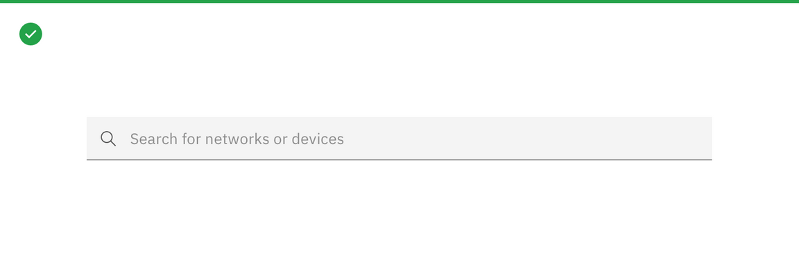
Provide useful placeholder text and include a search icon.
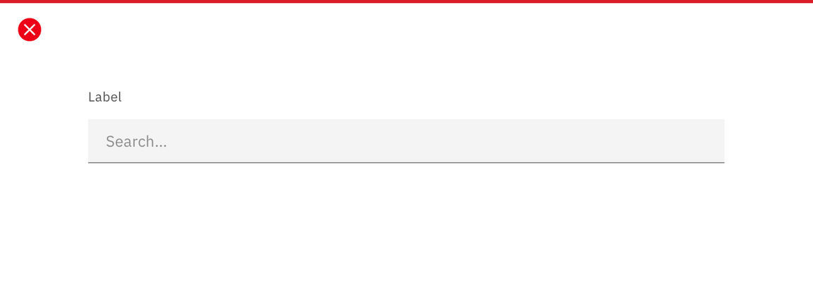
Don’t include a label for search fields.
Localize the search field
For languages that read right to left, flip the layout of the search box as shown in the next example.

Example of a search box for languages that read right to left instead of left to right
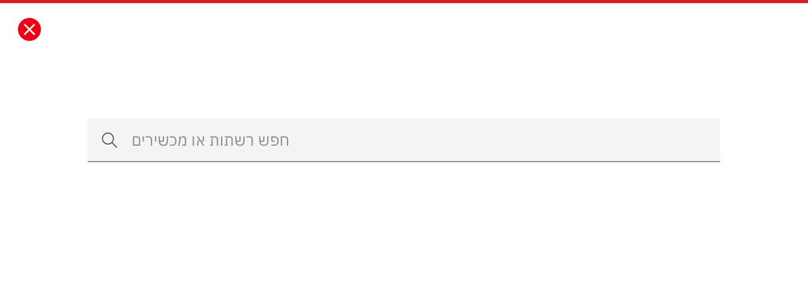
The search icon is recognized and acceptable across languages and countries.
Add a scope filter to your search field
The optional scoped search allows users to limit their searches to a section or category of content on a website, as opposed to a global search that searches everything at once. Only one scoped category can be selected at a time, but the dropdown should always include an “All” or “Any” option, and this option should be selected by default. With “All” or “Any” selected, the field will function as a basic global search.
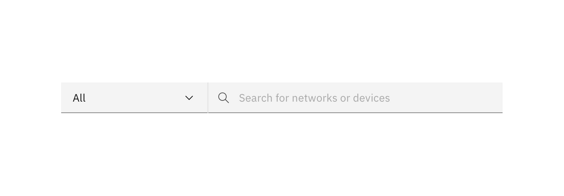
Example of a scope filter on a search field
Basic search
Basic search entails any search that directs users to a distinct results page. In these instances, offer either trending searches that match the active user’s keywords, recent searches by the active user, or both.
A basic search does not actually query a data set until the user runs the search.
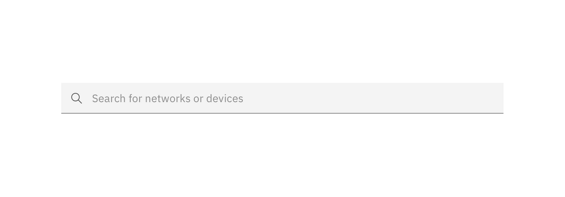
Example of a basic search field
| When to use | |
|---|---|
| When searching is expensive | Searching a large body of information can be resource intensive and expensive, expecially in instances where many users are searching the information simultaneously. Actively running the search after every character is entered or removed can be impractical. |
| When searching is slow | If the body of information is massive, actively searching can become too slow to be practical. Extended processing time following each character entered results in an application or website seeming unresponsive. |
| When the information is unfamiliar | When users are searching an application or website they’re unfamiliar with, a dedicated search results page can give them a better idea of data structure and available resources. |
Behaviors
Recent search suggestions
When a user clicks or tabs into a search field, they are be shown a menu of either the user’s recent searches, trending searches, or both. When the user types in the field, this menu is replaced with suggestions based on the search query.
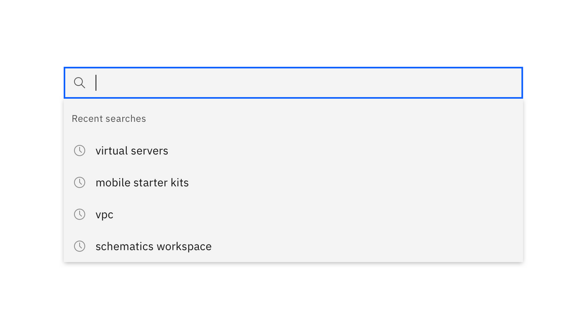
Type-ahead suggestions
Type-ahead suggestions are generated from ongoing analyses of use search patterns, and place minimal load on servers. Without committing to a search, the user can see a preview of results, suggestions of additional search terms, or zero in on what they were looking for.
Type-ahead suggestions appear as soon as the user begins typing in the search field.
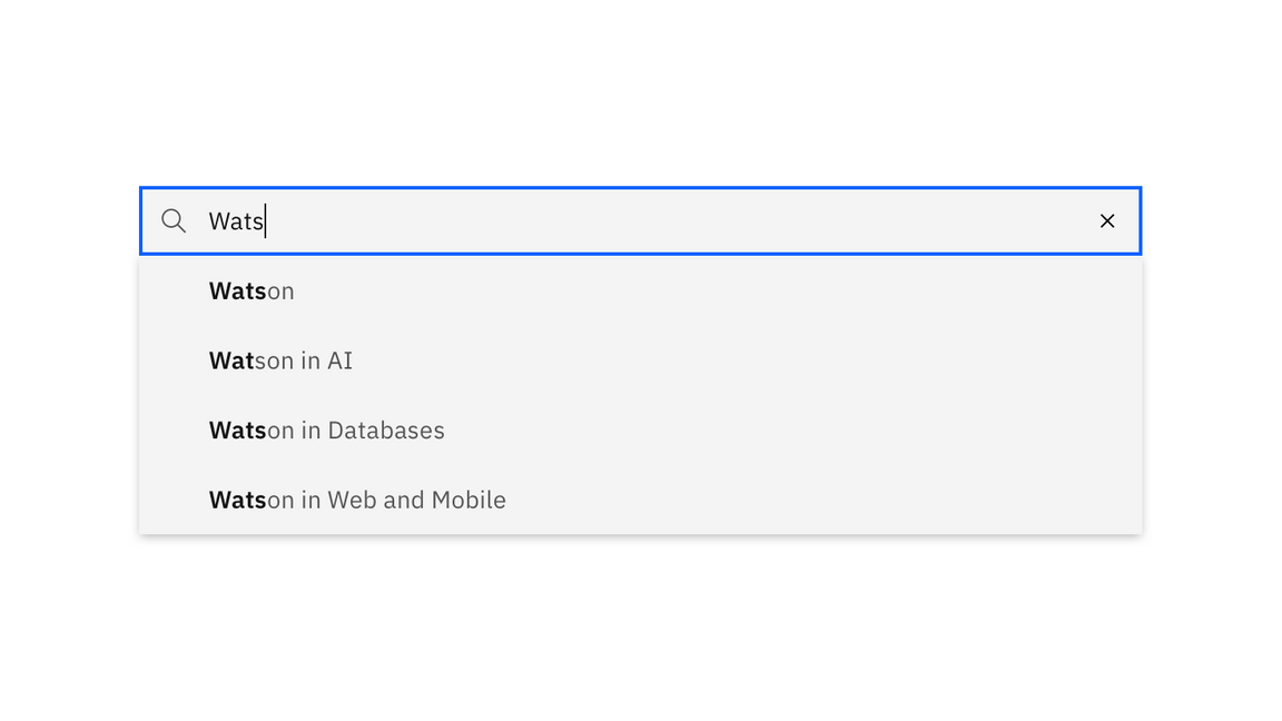
Example of type-ahead suggestions
Results page
Once the user runs the search, they are directed to a distinct results page. On this page, the user should have the option to select filters to narrow their search results. If you’d prefer to offer filters before the user searches, consider adding a scope filter.
The design of the results page will depend largely on the needs of your product, and more specific design guidance for a search results page will be covered in future pattern guidance.
Active search
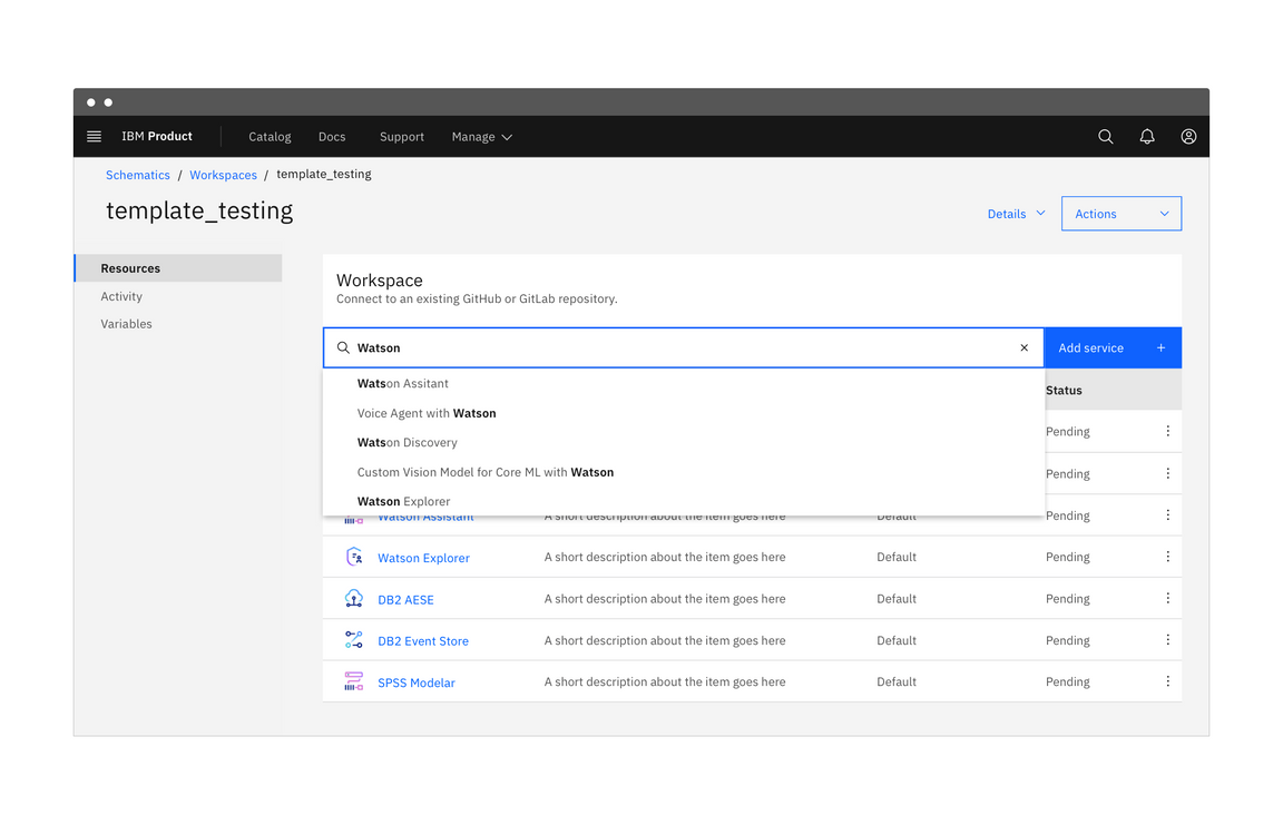
An active search is a rapid way to search an application or data set. The search runs after each character is entered, and results are shown immediately below the search field. You can think of active search as a way to filter a dataset through keywords.
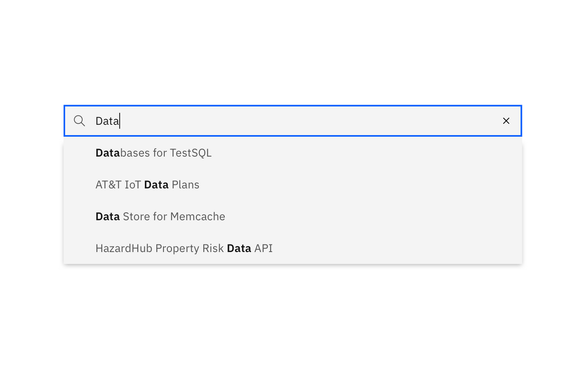
An active search is constructed from a search field, a search icon, and an X that serves as a clear or cancel button. There is no Search or Go button, as the search is run actively and the user is not routed to a results page.
Example of an active search field
| When to use | |
|---|---|
| When data is limited | Active searches should be used in instances where the search is likely to return an accurate result, like a small website or data table with limited data. You can also use active search when looking through a catalog of items, like a product catalog or a library. |
| When users know what to look for | If users are familiar with a website or application, search will likely be used to find a resource the user knows exists. Actively returning results in the search results panel allows them to navigate directly to the page or resource. |
| When filtering an on-page catalog | If your product presents a catalog on a page, you can use an active search to refine options based on the query. |
Behaviors
Search field
Active search placeholder text should be more specific than a basic search and should remain visible until the user begins typing in the search field. You can optionally add a “See all results” item to your results panel, which when clicked behaves as a basic search.
If you are using active search for a catalog or library, refine the on-page results as the user types.
Example of an active search field
Presenting results
Active search is intended to be a quicker search-in-place experience. The user should find what they’re looking for in the results panel. Recent searches from the active user should appear in a panel below the search field and should be replaced by matching search results when the user begins typing.
You can also implement active search for a small set of information displayed on a full page, like a catalog of offerings. Before the search is run, all items should be displayed. Once the user begins typing, only show items that match the user’s search.
Focused search
A focused search is a combination of basic search and active search. The user is actively shown results within their immediate page, product, or scope. Below those results, they have the option to widen their scope to search all available data.
Focused search is ideal for users who are using a specific tool that is part of a catalog or suite.
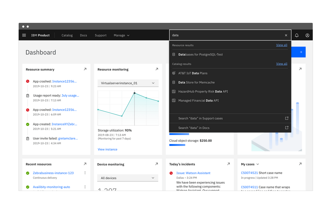
Example of a focused search with results panel
| When to use | |
|---|---|
| Within a product suite | A focused search can actively present results related to the active user. This limits the resources required for the search while still giving users the option to widen the scope of the search to an entire product catalog or database. |
| Within a folder or data set | Focused searches are ideal for searching within a folder or bucket, as the user can either further focus or expand the search through a data structure. If the results panel doesn’t deliver what the user needs, they can choose to search elsewhere without navigating away from the search field. |
Behaviors
Search field
A focused search queries for results related to the search’s focus, whether that is a user, a category, or a data set. The search results are presented in a panel just like in active search, but below the results an option to widen the scope and see a full page of search results is included.
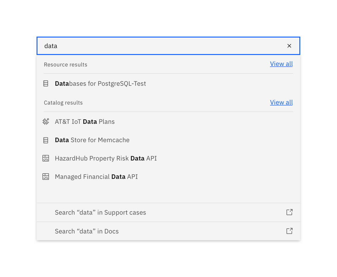
Example of focused search
If the user chooses a subcategory from the results panel, the search functions like a basic search with a filter applied. Any selected filter should persist during future searches until the user either discards the filter or begins a new session.
Presenting results
When the user clicks or tabs into the focused search field, a menu appears with recent searches from the active user, suggestions specific to the user or session, or both. When the user begins typing, the suggestions disappear and the results are refined, following each character entered.
You can also cluster active results by category with the option to “View all” within the category. This is ideal for a user who may be searching within several similar data sets without knowing where the information lives. If the user is likely to know the location of their data, offer a scope filter.
A successful focused search will route a user directly to a page or resource. In the event the user does select “See all results”, present a results page. Always include the number of search results, including for searches with no results.
Accessibility
Search
Users should be able to TAB into the input field of the search box to begin
typing and press ENTER to run the search query.
If using a scope dropdown and/or type-ahead suggestions, those should also be
navigable by keyboard. For scope, TAB should select the dropdown and the
ARROW keys should open it to cycle through the menu. ENTER should make a
selection from the dropdown and advance the user to the input field of the
search box.
For type-ahead suggestions, the ARROW keys should cycle through displayed
suggestions, with ENTER choosing a suggestion and ESCAPE allowing the user
to exit the type-ahead menu without selecting anything.
Faceted filtering
Users should be able to TAB into the filter panel to cycle through the
different groups. Pressing ENTER moves the selection to the facets inside a
group, allowing the user to move through the facets with the ARROW keys.
Pressing ENTER while a facet is in focus would toggle select or deselect the
facet.
After a facet is selected or deselected, the focus state should be retained as
the content reloads, that way users don’t have to TAB through everything again
as they move down the list.
Related
Patterns
References
- Apple Human Interface Guidelines, Search Fields (2019)
- Nick Babich, Best Practices for Search Results (2017)
- Think with Google, In-App Search (2016)
Feedback
Help us improve this pattern by providing feedback, asking questions, and leaving any other comments on GitHub.