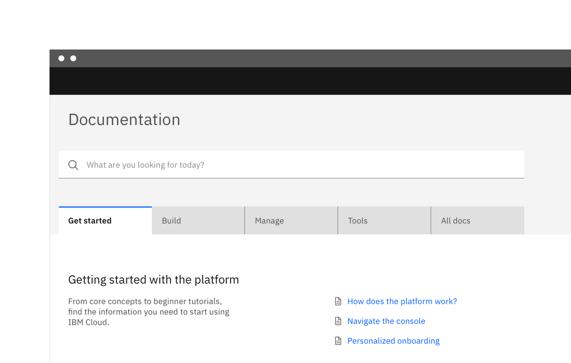
Tabs
Use tabs to allow users to navigate easily between views within the same context.
Overview
Tabs are used to quickly navigate between views within the same context.

Live demo
Formatting
Tab label
Each tab label describes the content contained within it. Labels are concise and use no more than two words. Keep in mind that at mobile widths and during translation, the character length of a label will impact the experience. Do not use icons in tab labels.
Number of tabs
In most scenarios, you should use no more than six tabs. This maintains an uncluttered UI and reduces cognitive load for users. If more than six tabs are needed, consider other navigation patterns, such as a side-nav.
Order
Tab order should be consistent across an experience. Tabs with related content should be grouped adjacent to each other.
Variations
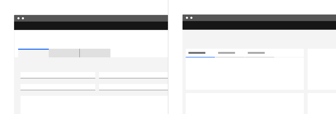
There are two variations of tabs, default and container. They are hierarchically the same and should never be nested within each other.
| Tab styles | Purpose |
|---|---|
| Default | A standalone tab that can also be nested within components. It is commonly used with smaller content areas. |
| Container | An emphasized tab that is always paired with an attached background container. It is commonly used for larger content areas, like sub-pages. |

Left: container tab. Right: default tab .
Feedback
Help us improve this component by providing feedback, asking questions, and leaving any other comments on GitHub.