4. Creating components
With two pages comprised entirely of Carbon components, let’s revisit the landing page and build a couple components of our own by using Carbon icons and tokens.
- Fork, clone and branch
- Review design
- Create components
- Use components
- Add styling
- Check accessibility
- Submit pull request
Preview
Carbon provides a solid foundation for building web applications through its color palette, layout, spacing, type, as well as common building blocks in the form of components. So far, we’ve only used Carbon components to build out two pages.
Next, we’re going to use Carbon assets to build application-specific components. We’ll do so by including accessibility and responsive considerations all throughout.
A preview of what you’ll build (see bottom of page):
Fork, clone and branch
This tutorial has an accompanying GitHub repository called carbon-tutorial that we’ll use as a starting point for each step. If you haven’t forked and cloned that repository yet, and haven’t added the upstream remote, go ahead and do so by following the step 1 instructions.
Branch
With your repository all set up, let’s check out the branch for this tutorial step’s starting point.
git fetch upstreamgit checkout -b react-step-4 upstream/react-step-4
Build and start app
Install the app’s dependencies (in case you’re starting fresh in your current directory and not continuing from the previous step):
yarn
Then, start the app:
yarn start
You should see something similar to where the previous step left off.
Review design
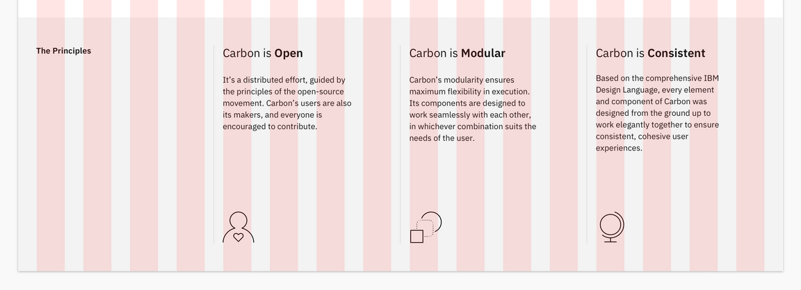
Here’s what we’re building – an informational section that has a heading and
three subheadings. Each subheading has accompanying copy and a pictogram. We’ll
assume that this informational section is used elsewhere on the site, meaning
it’s a great opportunity to build it as a resusable component. As for naming,
we’ll call it an InfoSection with three InfoCards as children.

Info section layout
Create components
First we need files for the components, so create an Info folder in
src/components. Even though we’re building multiple components, their names
all start with Info, so it makes sense to have them share one folder in
components. Create these files:
Add files
src/components/Info├──_info.scss├──index.js└──Info.js
Import _info.scss in app.scss after all of the carbon-component imports.
src/app.scss@import './components/Info/info.scss';
Like our other components, index.js will serve as an entrypoint. Since
Info.js will export mutliple components, we’ll use the * wildcard in the
entrypoint export.
src/components/Info/index.jsexport * from './Info';
InfoSection component
Let’s create the parent component that includes the “The Principles” heading.
That markup currently looks like this in LandingPage.js:
src/content/LandingPage/LandingPage.js<div className="bx--row landing-page__r3"><div className="bx--col-md-4 bx--col-lg-4"><h3 className="landing-page__label">The Principles</h3></div><div className="bx--col-md-4 bx--col-lg-4">Carbon is Open</div><div className="bx--col-md-4 bx--col-lg-4">Carbon is Modular</div><div className="bx--col-md-4 bx--col-lg-4">Carbon is Consistent</div></div>
We want to do a few things when abstracting it to a component. First, we only
want Carbon (bx--) and this component’s class names; we don’t want to include
landing-page__r3 as that’s specific to the landing page. For that we’ll use
React props so we can pass in and use props.className.
We’ll also:
- Add component class names like
info-sectionandinfo-section__heading - Semantically use
<section>instead of<div> - Update the grid columns to match the design
- Replace
The Principleswith{props.heading} - Replace columns 2 - 4 with
{props.children}
Using props we can render any heading and any number of children components
(InfoCard that we’ll build soon.)
src/components/Info/Info.jsimport React from 'react';const InfoSection = (props) => (<section className={`bx--row ${props.className} info-section`}><div className="bx--col-md-8 bx--col-lg-4 bx--col-xlg-3"><h3 className="info-section__heading">{props.heading}</h3></div>{props.children}</section>
At this point let’s add styling for the new class names that we just added.
src/components/Info/_info.scss.info-section__heading {@include carbon--type-style('heading-01');}
InfoCard component
Next up we’re going to build a component for columns 2 - 4, which currently
looks like <div className="bx--col-md-4 bx--col-lg-4">Carbon is Open</div>. At
the bottom of Info.js, add:
src/components/Info/Info.jsconst InfoCard = (props) => {return (<article className="info-card bx--col-md-4 bx--col-lg-4 bx--col-xlg-3 bx--offset-xlg-1"><h4 className="info-card__heading">{props.heading}</h4><p className="info-card__body">{props.body}</p>{props.icon}</article>);};
In doing so, we:
- Used the semantic
<article>instead of<div> - Added
info-cardclasses - Used
propsto render the heading, body copy, and icon - Set columns to match the grid
Use components
Nothing is styled yet, but with our components built let’s put them to use. In
LandingPage.js, import the components towards the top of the file.
src/content/LandingPage/LandingPage.jsimport { InfoSection, InfoCard } from '../../components/Info';
While we’re at the top of LandingPage.js, import the icons that we’ll need as
well.
src/content/LandingPage/LandingPage.jsimport Globe32 from '@carbon/icons-react/lib/globe/32';import PersonFavorite32 from '@carbon/icons-react/lib/person--favorite/32';import Application32 from '@carbon/icons-react/lib/application/32';
With everything imported, replace the current:
src/content/LandingPage/LandingPage.js<div className="bx--row landing-page__r3"><div className="bx--col-md-4 bx--col-lg-4"><h3 className="landing-page__label">The Principles</h3></div><div className="bx--col-md-4 bx--col-lg-4">Carbon is Open</div><div className="bx--col-md-4 bx--col-lg-4">Carbon is Modular</div><div className="bx--col-md-4 bx--col-lg-4">Carbon is Consistent</div></div>
With the new components:
src/content/LandingPage/LandingPage.js<InfoSection heading="The Principles" className="landing-page__r3"><InfoCardheading="Carbon is Open"body="It's a distributed effort, guided by the principles of the open-source movement. Carbon's users are also it's makers, and everyone is encouraged to contribute."icon={<PersonFavorite32/>}/><InfoCardheading="Carbon is Modular"body="Carbon's modularity ensures maximum flexibility in execution. It's components are designed to work seamlessly with each other, in whichever combination suits the needs of the user."
Add styling
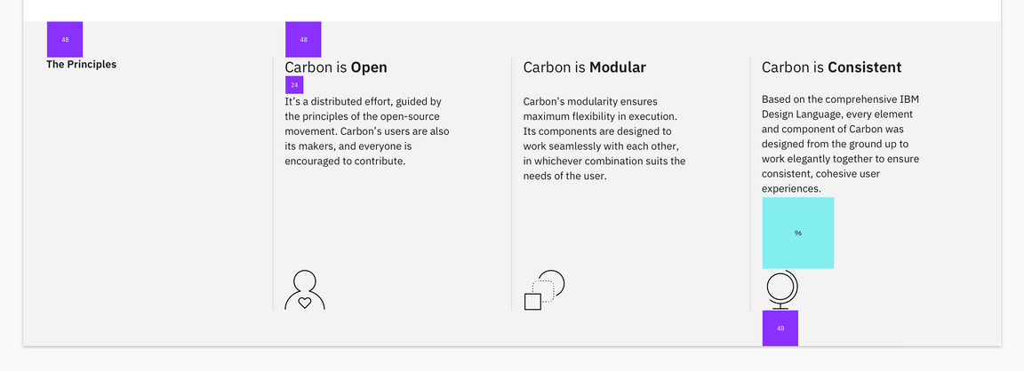
Here’s our design showing the spacing tokens that we need to add. We also need to set type style and borders.

Layout
Starting with layout, add the following to src/components/Info/_info.scss.
src/components/Info/_info.scss.info-card {margin-top: $spacing-09;display: flex;flex-direction: column;svg {margin-top: $spacing-09;}
Once you save, go ahead and resize your browser to see the responsive layout at
the different breakpoints. Make sure to review these color and spacing tokens.
There are also a few breakpoint mixins that may be new to you. The
@carbon/layout
SassDoc
is a great reference to see what all is available.
Type
Our InfoCard headings look to be too small. We need to increase their font
sizes according to the design spec with:
src/components/Info/_info.scss.info-card__heading {@include carbon--type-style('productive-heading-03');}
Also, the design has the last word in each subheading as bold. To accomplish
that, add this helper function after the import in Info.js.
src/components/Info/Info.js// Take in a phrase and separate the third word in an arrayfunction createArrayFromPhrase(phrase) {const splitPhrase = phrase.split(' ');const thirdWord = splitPhrase.pop();return [splitPhrase.join(' '), thirdWord];}
Then, update InfoCard to use createArrayFromPhrase.
src/components/Info/Info.jsconst InfoCard = (props) => {const splitHeading = createArrayFromPhrase(props.heading);return (<article className="info-card bx--col-md-4 bx--col-lg-4 bx--col-xlg-3 bx--offset-xlg-1"><h4 className="info-card__heading">{`${splitHeading[0]} `}<strong>{splitHeading[1]}</strong></h4>
Finally, add the declaration block in _info.scss to set InfoCard body copy
styles and to bottom-align the icons.
src/components/Info/_info.scss.info-card__body {margin-top: $spacing-06;flex-grow: 1; // fill space so icons are bottom aligned@include type-style('body-long-01');// prevent large line lengths between small and medium viewports@include carbon--breakpoint-between(321px, md) {max-width: 75%;}
Check accessibility
We’ve added new markup and styles, so it’s a good practice to check DAP and make sure our rendered markup is on the right track for accessibility.
With the browser extension installed, Chrome in this example, open Dev Tools and run DAP.

DAP violations
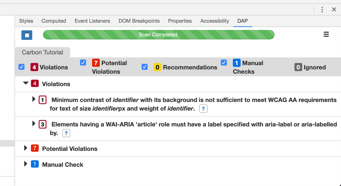
That first violation is for the off-screen “skip to content” link. This link isn’t shown and is used to assist screen reading, so the color contrast violation can be ignored.
But, those three other violations came from the <article> element used in new
InfoCard. Since the <article> element requires a label, it seems like we may
be using the wrong semantic element. A humble <div> will suffice.
In Info.js, replace the <article> opening and closing tags with <div>
tags.
Submit pull request
We’re going to submit a pull request to verify completion of this tutorial step.
Continuous integration (CI) check
Run the CI check to make sure we’re all set to submit a pull request.
yarn ci-check
Git commit and push
Before we can create a pull request, stage and commit all of your changes:
git add --all && git commit -m "feat(tutorial): complete step 4"
Then, push to your repository:
git push origin react-step-4
Pull request (PR)
Finally, visit
carbon-tutorial to
“Compare & pull request”. In doing so, make sure that you are comparing to
react-step-4 into base: react-step-4.